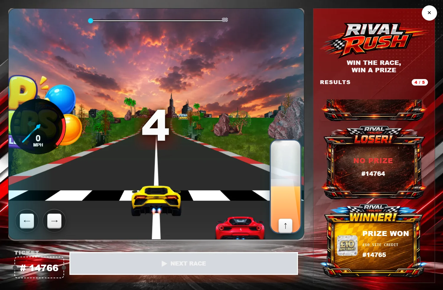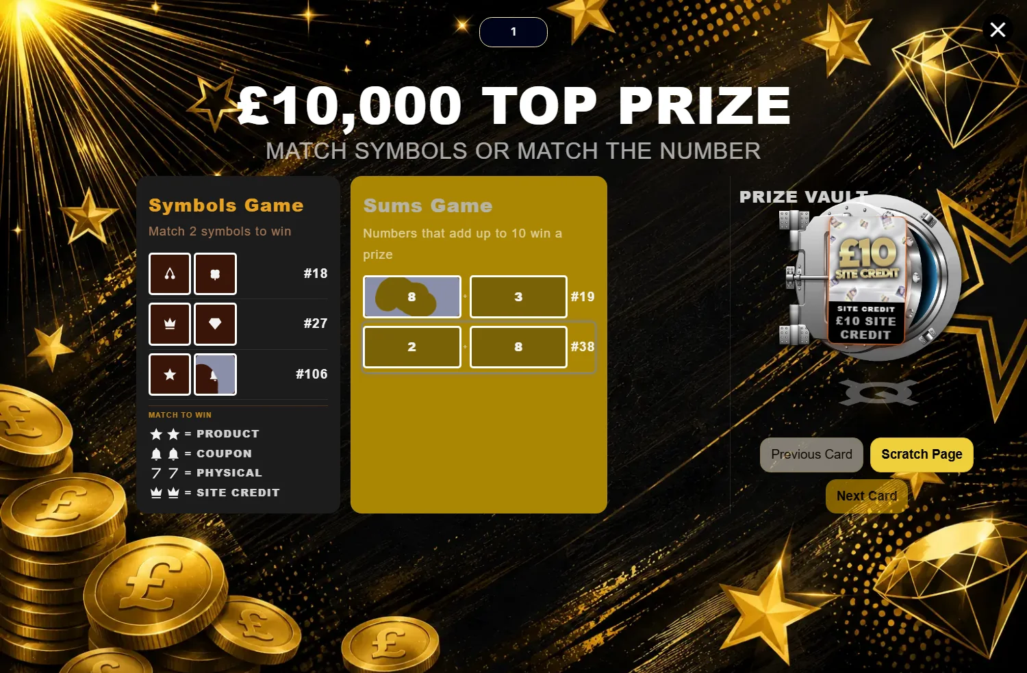
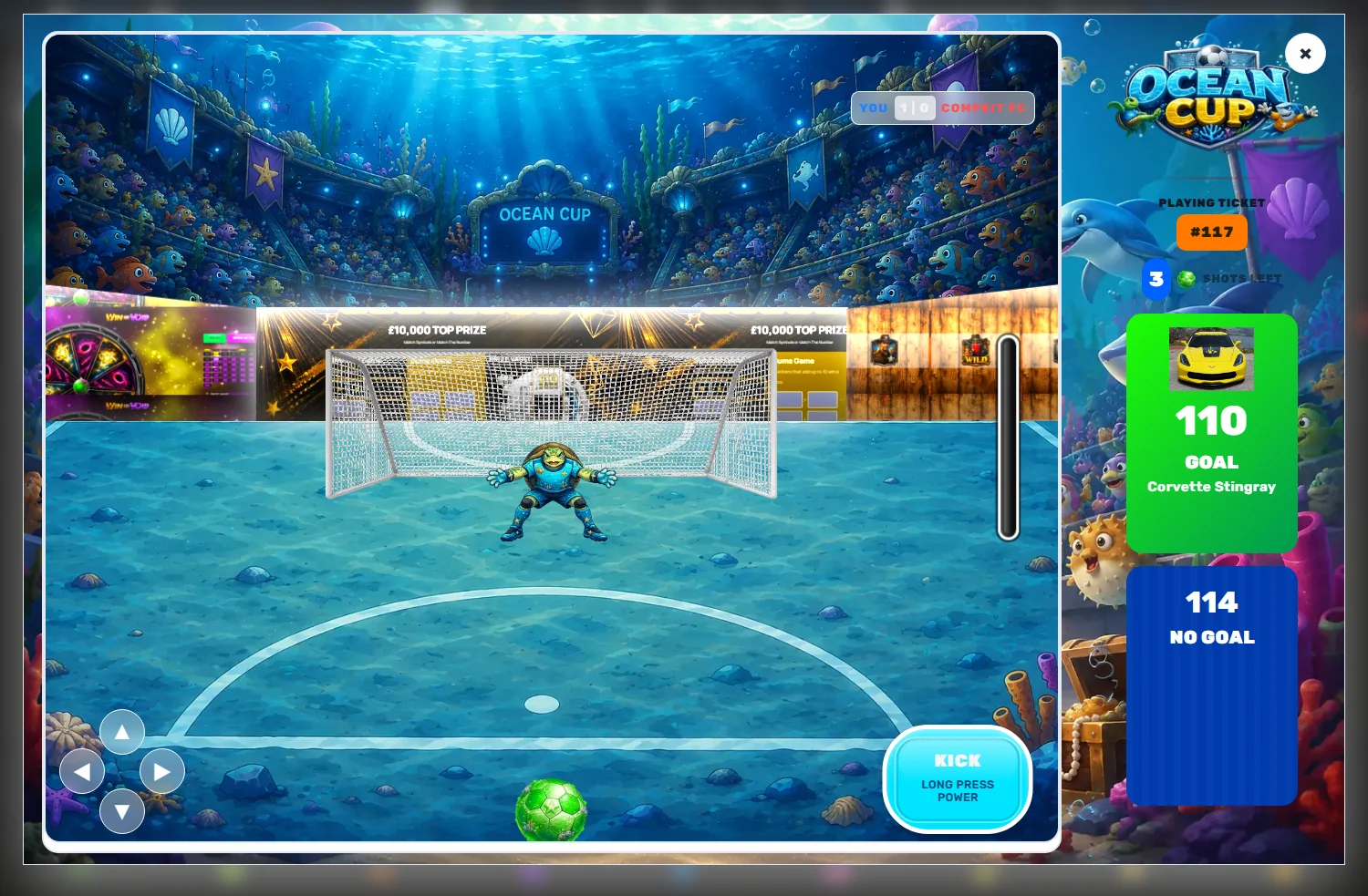
Competition traffic skews heavily to mobile. Somebody sees a draw on Instagram at nine in the evening, buys five tickets on their phone, and plays the reveal on the same phone thirty seconds later. That is the entire journey, and a desktop monitor appears nowhere in it.
Reveal games, meanwhile, get designed at 1440 pixels wide with a mouse. The mismatch is not usually catastrophic — it is a slow leak. Text that is comfortable at desktop size becomes cramped. A button that reads well in a wide bar gets squeezed. A play area that fills a browser window collapses to something apologetic.
Responsive is not the same as designed
A reveal that merely fits on a phone is not the same as one that was decided for a phone. The layout adapts, but every judgement inside it — the heading size, the spacing, the height of the play area — was made while looking at a monitor.
The honest test is not whether it fits. It is whether you would be pleased to receive it.
Device twins: two values for the settings that matter
The approach CompKit takes is that a curated set of settings — sizes, spacing, heights, text scales — carries a mobile twin. The base value stays the desktop one, and the mobile half defaults to match it, so nothing changes until you deliberately make it change.
These are not separate stylesheets or a second theme to maintain. They are two numbers on the same control, swapping at the breakpoint the layout already switches at — 520 pixels on slots, 700 on spin, and so on per game.
You only reach for the mobile half when the desktop number is genuinely wrong on a phone, which is usually about a dozen settings out of a couple of hundred.
The editing switch
There is a subtle failure mode with any dual-value system: you drag a mobile slider while the preview is showing desktop, watch nothing move, and conclude the setting is broken.
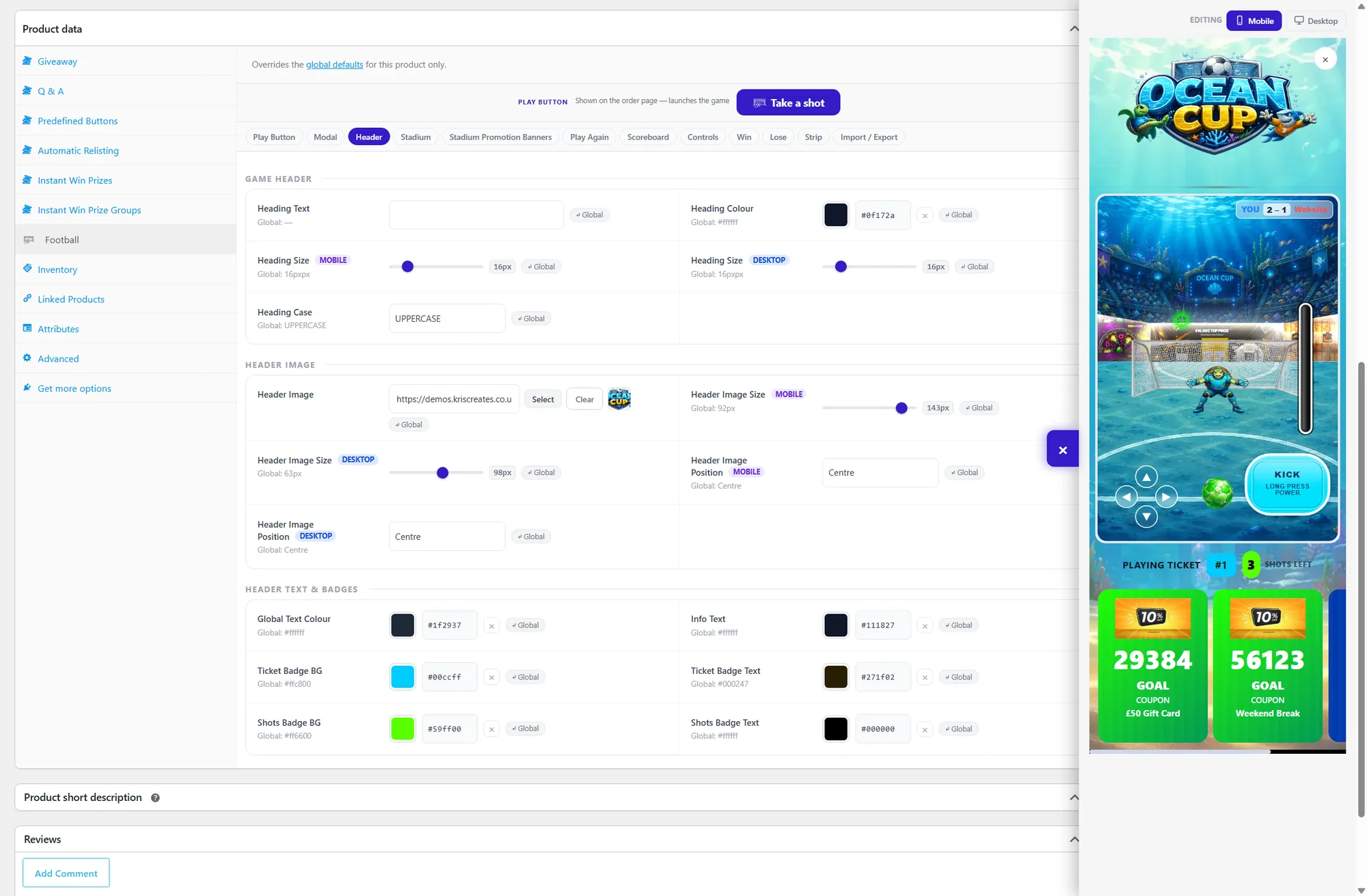
Hence the Editing switch on the preview. It tells the panel which half you are working on, so the preview reads the twinned values device-aware. Drag a mobile size while the preview is in mobile mode and it actually moves.
If a setting is not doing anything, check which side you are editing before you assume it is broken. That is the answer more often than not.
Preview honestly
Two things make the preview trustworthy rather than decorative.
The desktop / mobile switch renders at a real desktop width and scales it down inside the settings column, rather than showing you a narrow column and calling it desktop. What you are looking at is proportionally what a desktop visitor gets.
The actual-size inspector opens the game at a true 100% in a full-screen overlay, closable by button, Escape or clicking the backdrop. That is the one to use before you publish, because a scaled preview will always flatter your type sizes.
A short pre-launch checklist
- Open the preview in mobile mode and read every piece of text. If you would zoom, it is too small.
- Check the play button label at phone width — long custom labels are where layouts break first.
- Look at the win and lose cards, not just the idle state. They are where the prize actually gets communicated.
- Use the actual-size inspector at least once. Scaled previews lie about legibility.
- Then open it on a real phone. Nothing replaces this, but doing the four above first means you are checking rather than discovering.
The thing worth over-investing in
If you only tune one thing for mobile, make it the moment the result appears. Everything before it is anticipation and forgives a lot. The result card is what people screenshot, share, and remember — and it is the bit most likely to be cropped, squeezed or scrolled past on a small screen.